
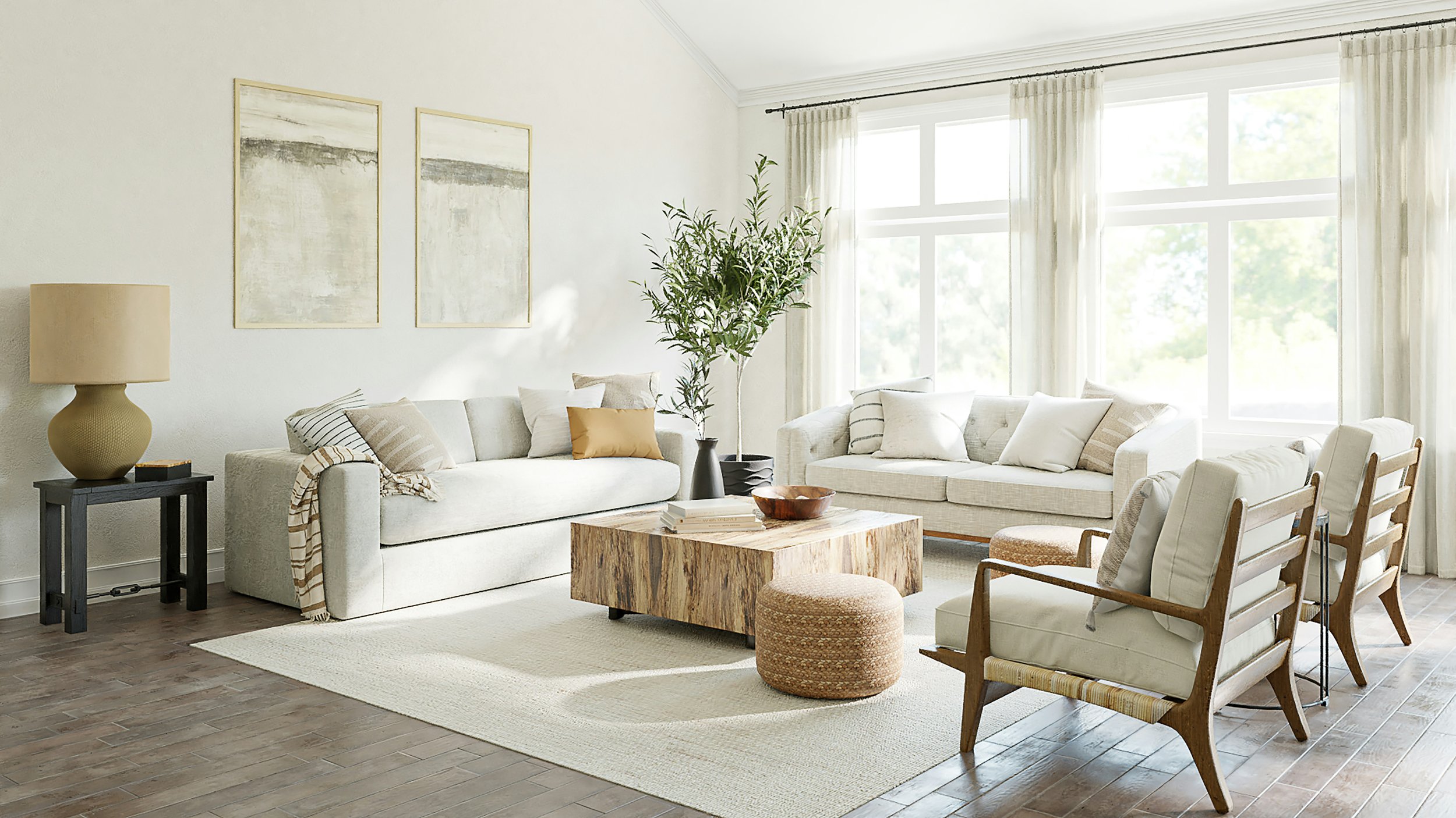
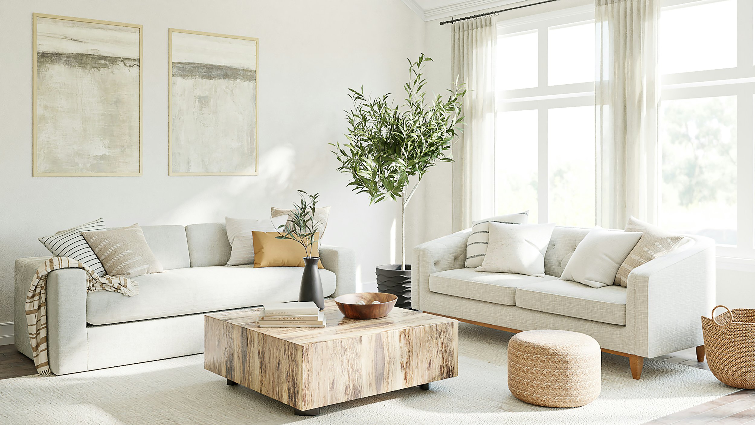
The rule of 60-30-10 In interior design: Understanding the basics
Today I'm excited to share with you a super handy design trick called the 60-30-10 rule. This rule is all about using three color ratios to create a space that's easy on the eyes and just feels right. Here's the basic idea: 60 percent of your room should be one neutral color, 30 percent should be a secondary color, and the last 10 percent should be your accent colors. Let me break it down for you:
60% – think paint, wallpaper, or even large furniture pieces
30% – this is where your big sofas, storage units, appliances, and cabinets come in
10% – save this for smaller furniture, side tables, and fun decorative bits and bobs
When you're diving into a makeover or renovation project, color is going to be one of the biggest decisions you make. You've got to consider your furniture, walls, ceiling, cabinets, countertops – the list goes on! It can be a lot to wrap your head around. But fear not, my friends, because the 60-30-10 rule is here to save the day. It helps you choose colors based on the size of your furniture and decor, with neutral colors as your trusty foundation and bright colors used sparingly.
The color of a room can totally change the vibe people get when they walk in. Blues, purples, blacks, and grays can make a room feel a bit chilly, while yellows, reds, and oranges can make it feel nice and cozy. Neutral colors like whites, creams, and tans help balance out those bolder hues.
60 – The Majority Rules!
Your walls will usually make up most of that 60%, along with some of your bigger furniture pieces. When you're giving a bedroom, family room, bathroom, or playroom a facelift, it's often best to keep your walls the same color to tie the space together. Larger furniture like couches, chairs, game tables, desks, and beds often follow suit.
Since 60% takes up most of your room, neutral colors are your best bet for this chunk. Creams, whites, tans, soft yellows, and even muted blues and greens are all solid choices.
Keep in mind that there might not be a massive difference between your primary and secondary colors. But you've got some leeway with this rule. For instance, some folks might jazz up a small part of their wall with a bold color like green or blue, instead of sticking with a neutral shade. Another trendy move is matching your wall color to your floor or cabinet color for a cohesive look.
30 – What's Your Secondary?
Your secondary color will take up around 30 percent of your room and will often be in the same family as your majority color. It's not too loud, but it's not too neutral either. If you went with cream or white for your room, a soft yellow, blue, or green could be a great secondary color. These usually pop up in medium to small furniture pieces, carpets, or rugs.
For example, in your bedroom or family room, your secondary color might be a light blue rug under your bed or couch. It can also be other furniture items that aren't too big, like beanbags, side tables, or pillows.

10 – Your Accent!
Your accent colors are the cherry on top of your room sundae and will take up the least amount of space. In the bedroom picture above, the dark blue is balanced out with orange accents in the pillows (complementary colors for the win!), stools at the end of the bed, and artwork above the bed.
People often want their favorite color to be the majority color, but usually, favorite colors are bright and bold, which can make a room feel a bit too intense. Instead, a great way to plan your room is to pick your favorite color and use it as an accent color, not the majority color. Then, build from there! This way, your favorite color is still in the mix while keeping a balance of colors in your space.
For the 10%, louder, brighter colors work best since they take up a small portion of the room. Think bold yellows, oranges, reds, greens, blues, and even purples to add some personality.
Pillows, blankets, and drapes can be your accent colors. But watch out for those drapes – think about their size. Sometimes, full window drapes can be a bit much, so you might want to put your drapes in the secondary color group instead.

Now, Here's When to Break This Rule…
Okay, now that I've spilled the beans on the rule, I know there are probably a few rebels out there who won't follow it to the letter. And that's totally cool because this rule is meant to be broken! In fact, you can even throw a fourth color into the mix. Just try to keep the ratios roughly the same, or else it won't be the 60-30-10 rule anymore.
Your majority color should be at least 50 percent of any room. Generally, it's best if it's more than that, but you could switch up the color scheme to 60-20-20 or even 50-30-20. In these cases, if you want to strike a color balance in your room, make sure your secondary color is similar to your majority color, not your accent color. Otherwise, you'll end up with a room that's a bit too loud. This bolder style can be great for smaller spaces but might be a bit much for your guests in a living or family room.
If you want to break the rule into four colors instead of three, 60-20-10-10 is a solid choice, and so is 60-15-15-10. Even 55-25-10-10 will work. The combos here are pretty flexible, but remember to save those bold colors for the smaller percentages.
And there you have it, folks – the 60-30-10 rule breakdown. I hope this helps you create a space that's beautifully balanced and feels just right for you. Happy decorating, and don't be afraid to put your own spin on things!
This article may contain affiliate links for your convenience. By clicking on any of these links and completing a purchase, we may earn a small commission, at no extra expense to you. Your support for this blog is greatly appreciated.